Day 3: In the Right Direction

Weight:215.2 lbs (97.6kg)
Ride Time: 1h — 3h15m total
Distance: 14.9 mi (~24km) — 46.8 mi (~75.3 km) total
Food Diary: Entry 2

Didn’t go shopping yesterday for goodies. But I ended up getting a package yesterday: a new fountain pen. 😀 This one is unbelievably unique in my opinion. Really fun. Very nice in the paw and very pleasing to the eye.

The maker is Marlen, out of Italy. The pen itself is part of their Vitis line in the Rose color. (On the cap it says “Special Collection” but not entirely sure how special it may be…) I hadn’t heard of them, but with the pens construction, I’m impressed. It’s outfitted with a 18k gold nib, which is always nice. After owning my first gold nib, I haven’t looked back — steel nibs just feel too scratchy and stiff, they’ve no life or variation.

What makes this pen interesting is that it is inspired by the early 1900s matchstick fillers. With this kind of a filler, a lever isn’t used or a plunger or a twist mechanism or any other fancy thing, but instead a small, well, matchstick (or the like) is inserted into a hole on the side of the barrel. Within the barrel is a rubber sac which has a flexible metal plate upon one side. When the stick is pressed down upon the plate, the plate depresses the sac, expelling whatever is in it, and when released, takes in whatever is there (air, ink, water, etc). The theory behind the matchstick filler is that it is not only simple and effective, but safe — read: no accidental leaks or jets of ink!

In other news, my binoculars should be coming today. 😀 Can’t wait for those… There are tons of birds in our backyard. Never really noticed how much I enjoyed bird watching until very recently.

The ride wasn’t nearly as rough as yesterday. Yesterday it was psychologically draining due to monotony: solid “cruising” speed for over an hour. This time there was variance with “cruising,” “steady,” and “max” efforts. Made it more tolerable. Tiring, but more tolerable.

About to cook up some chicken tenderloins and have chicken wraps. Should be able to have lunch with my partner when it gets home. There is a chance we may be celebrating something too. 😀

Until later, be safe and enjoy y’all’s days,

Bae

Sheaffer’S 1500/500 Pen Set

And welcome back to another fountain pen post! …I have yet to come up with a catchy, snazzy name.

In any case, today I present to you the set that I bought for my birthday:

WP_20140924_001

It is a Triumph nib 1500 with matching 500 pencil. It comes presented in a rather nice case. It doesn’t have the original papers and the bottom portion doesn’t come out easily so I imagine it isn’t meant to come out. What I didn’t notice until I started to take pictures was the barely visible “Sheaffer’S” on the front of the case. I thought that was a neat little addition to the case.

This set is actually being a total pain to ID, but I do love doing detective work. That’s half the fun of collecting things like this. You are often presented with something and if you want to find out more about it, you have to dig around a bit to find information. Let’s start with the filling mechanism:

WP_20141001_11_06_22_Pro

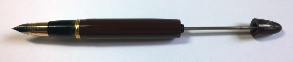
This pen fills with the venerable vacuum filling system. The blind cap (also known as a plunger cap) unscrews and when pulled back reveals a rod. This rod is connected to a disk within the body of the fountain pen. Very simple method of filling — but also very delicate. If too much force is applied in either direction, ink can force its way out between seams between the nib section and body! This mechanism was put into the Sheaffer line-up in 1934 and remained in use until the Touchdown filling mechanism was introduced in 1949.

There is our first window: 1934-1949.

What about the nib? Well, the Triumph nib — which is worth an article on its own — was introduced in 1942.

WP_20141001_11_18_45_Pro


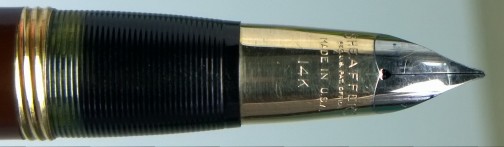
Initially the nibs had the full hallmarks of the older non-Triumph nibs which included the “Lifetime” imprint. But approximately in the spring of 1948 that hallmark was mostly dropped then entirely in 1949 with the full roll-out of the Touchdown pens. In the same year a new method for making the nibs was devised and pushed into service.

Our updated window: 1948-1949. Getting pretty tight there…

This pen is a white dot model. And you wouldn’t notice that unless you looked at the tip of the plunger cap:

WP_20141001_11_05_13_Pro

Sheaffer had a beast of a time trying to get the white dot on metal caps for the longest time. They always kind of just settled to put it somewhere else on the body of the pen. But by 1949 they had figured out how to put it onto metal caps. This was applied to all white dot models from 1950 onwards. Since the pen still has a dot on the plunger cap… we know for a fact this pen was made pre-1950.

Well, that didn’t really help too much beyond really cementing the 1950 date. Needless to say, we can probably say with some confidence that this pen was manufactured within 1948-49.

Pictorial research suggests that the “1500” imprint is the price: $15.00. And this is a Sentinel set.

This slideshow requires JavaScript.

I cannot find an example of this color with a vacuum fill at all. Even if it were exposed to sunlight and the color aged from a burgundy, the portions that are protected from UV should remain unchanged. Not to mention that UV discoloration is fading not darkening.

With the release of the Touchdown model, however, new colors were added. Though this is not the Crest (characteristic gold cap), we can use it for some information. At first the Crest was released with striated colorations and solid black plastic. However, in the late 1940s many of Sheaffer’s pens were going into injection molded solid colored plastics. The Crest was available in black, blue, green, and burgundy. The Touchdown Sentinel, when released in 1949, was released with black, burgundy, evergreen green, Persian blue, and burnt umber brown. This pen, when compared against a 1949/50 burnt umber brown Touchdown Statesman, matches that brown. (Link is from Vacumania’s Sold Sheaffer pens section.)

A theory, that comes from that tidbit of information, is this pen was produced in 1949 and is a late model/bridge between several things: 1) the transfer out of the vacuum fill and into the Touchdown, 2) the transfer into a new color set, and 3) the transfer from dots on the plunger cap/blind cap to dots on metal caps. If that is really true, then this is a pretty neat pen!

The other theory is this is all gibberish. Which might be the case and I honestly wouldn’t be surprised. As with typewriters, manufacturing history is hard to come by and is often riddled with cross overs, brand takeovers, and the like. But still… it would be neat. Haha!

Performance wise, the pen is absolutely fantastic. Ultra smooth and just feels great in the paw. It’s much lighter than what one would expect. It can be used with the cap unposted, but the cap does add some balance. The nib is far broader than what I normally write with and forces me to write larger than what I’m accustomed to.

The pencil has the original eraser and lead — both are hard as rock. I’ll be needing to replace both… Easy fix. The lead will be replaced with B softness and the eraser can be home manufactured easily enough. Thickness wise, it is, again, broader than what I’m used to at 0.9mm.

The set sits well in the pocket and the caps look simply stunning. I rather enjoy the plain face of them without the “Sheaffer’S” engraving that is present on my Touchdown TM Admiral’s clip. The absent white dot on the metal cap doesn’t bother me either as it’s absence adds to the simplicity. It’s almost a kind of sleeper pen: most would think it’s a cheap office supply store set until the cap comes off and reveals something totally unexpected and different.

All in all, I’m definitely going to be giving this set it’s chance in the sun — something that it’s probably been waiting for, for a long time. I will, however, been sending it in for some refinements. The filling mechanism, I feel, needs some love and I might even risk getting the nib modified a wee-bit. This pen would be fantastic with an 0.5mm or 0.7mm stub!

Until next time, I hope you have a great day and be safe out there! 🙂

My First “Real” Fountain Pen

Sooo since I talked about the Adler a bit, which was made in West Germany, I decided to post up a fountain pen I own that is also German. Germans must have this thing for making absolutely amazing products… I dunno, maybe it’s just me.

I feel like I should clarify something. I use “real” because my first fountain pen was a lower-end cartridge filler by Cross, which sadly isn’t made in its original form anymore — nor that color. I had two of those and I actually gifted a third to a friend in high school way back when. The first ended up being stolen somehow. The second ended up thinking I enjoyed having ink on my paw so I ended up giving up on it.

Upon that happening, I realized rather quickly that I couldn’t live without a fountain pen. I have been using them since I purchased the first one. Something has always fascinated me about them. Typewriters are the same way… there’s like a mystique about these items.

There’s something about both of these items, that when you shop for them, they encourage you to find something that is fun and matches you. The Fountain Pen Hospital had this little gem in stock:

The box, the presentation box, the pen, and the bottle of ink. That bottle is the same one I've used since I've bought the pens. Goes to show how well these pens distribute ink in an economical but fluid way.

The box, the presentation box, the pen, and the bottle of ink. That bottle is the same one I’ve used since I’ve bought the pens. Goes to show how well these pens distribute ink in an economical but fluid way.

This pen is Pelikan’s M205 Demonstrator (Blue). What does a demonstrator mean? Well, a better example is the Noodler’s Konrad I have. That is what a demonstrator is: you can see every little bit of it.

As you can see, Pelikan employs a "cap within a cap" design which, on the demonstrators, clearly shows how easily ink can get trapped between the layers. The piston is clearly visible within the barrel of the fountain pen as well!

As you can see, Pelikan employs a “cap within a cap” design which, on the demonstrators, clearly shows how easily ink can get trapped between the layers. The piston is clearly visible within the barrel of the fountain pen as well!

It is limited production (not edition) and is no longer made. I’ve had two of these… The first, of course, was stolen somehow — which is a story unto its own. I was lucky enough to find a second one online. But I ignore that loss and say I’ve had the pen for at least 6 years since they are essentially the same pen — one just had a different fineness (XF v F).

The nib. Though it might be obvious, the "F" stands for Fine. The original one I had was an XF. These nibs can be screwed out and are interchangeable with all M205 compatible nibs.

The nib. Though it might be obvious, the “F” stands for Fine. The original one I had was an XF. These nibs can be screwed out and are interchangeable with all M205 compatible nibs.

This pen was my introduction to what a fountain pen “should” be like: Immortal styling, an inspiration to write with, and fun to look at and hold. It is a piston filler, which means it can only be filled from bottled ink and has a generous capacity. The nib is smooth and has just enough give to allow comfortable, springy writing. With a thinner barrel, it’s an ideal pocket pen — but that thinner barrel also means that over long writing periods your hand can tend to cramp.

But even with the handicap of potential cramping, this pen easily takes the cake for sheer volume of pages written with it. I’ve not restricted myself to just that bottle of Pelikan ink either… Through Goulet Pen’s Ink Drop, I’ve sampled probably a 50+ inks with this pen alone as this is my baseline for piston-filler compatibility. It works well with even the more intense inks that say “Do not leave in fountain pens” like J Herbin’s 1670 Anniversary Rouge Hematite. I ended up leaving this pen filled with this ink over a period of over a month with no ill effects to any component!

With all these glowing reviews, I have to sadly report that it is due for a check up with a nibmeister. It’s put away in the pen case until then. But strangely even though it does need some TLC, I always turn to it in times of need. When all other pens fail to inspire, I need but to ink this one up not half-way and words flow onto the page as quickly as the hand scribe them.

As always, thanks for reading! Have a great day and be safe out there. 🙂

Alive and… (Fountain Pens?)

Somewhat below kicking? Love that track

Alive is good. Yes, alive is good.

I’ll just sum everything up in one word: medical.

With that covered and explaining my silence after the conclusion of the Skyriter project, here we go.

So, what we’re going to talk about is actually a fountain pen. The reason why this comes up is I own one that I haven’t been able to use until now. Why? Well, it’s a Noodler’s Ink Konrad.

These fountain pens are notorious for needing to be tweaked after purchase. They’re all handmade but are incredibly affordable — like, $20USD affordable. What can make these pens unusable are two things (usually): 1) the ink flow is way too wet or 2) the flow stops suddenly and won’t restart.

However, both of the cases can be solved by employing the following: a little O-ring and/or heat setting the feeds to the nib. And thanks to my long-time penpal — who graciously mailed me an O-ring and detailed instructions — I was able to do this.

WP_20140910_17_19_27_Pro

The ink used is also my favorite non-traditional ink. It is also made by Noodler’s Ink. In this pen, the ink is used to its full potential as it can shade with it giving this delightful range of deep purple-black to a royal purple.

Because the nib can flex with some pressure it allows rather expressive writing from what is a cheap writing combination. A flex nib fountain pen is often an expensive affair. Really good flex nibs exist for steel pens —  used for scripts like Spencerian. Those can be so flexible that they are termed “wet noodle” nibs, literally going from hairlines to 3-4mm in width! This particular Konrad can flex from approximately 0.2mm to just over 1mm. An impressive range considering the price.

I’ve actually had this pen since… I wanna say 2012 when it came out. Two years of disuse is a long time. But the wait was well worth it. This is now my go-to desk pen when the paper is appropriate for fountain pen ink.

Eversharp Slim Ventura, c. 1955

Alright guys n’ gals. I figured I’d start posting up tidbits about the fountain pens I own. These type of posts — since this is the first, I’ll get this out of the way — are part informational, part review. I am a user of fountain pens first and a collector second. My philosophy toward typewriters (that they should be used if they can be) applies to fountain pens and in fact fountain pens is where that idea came to be.

Today, I’d like to talk about the Eversharp Slim Ventura.

This line was Eversharp’s last real attempt at making a quality pen. All pens after this dropped dramatically in quality as well as cost. As a last attempt, or possibly more accurately a farewell, I think they did an admirable job. These pens were produced in a variety of colors. These had plastic barrels and metal caps in three grades: gold filled cap and clip, sterling cap with gold filled clip, and gold filled cap with sterling clip. To these they added two metal versions: gold filled and sterling silver.

The set that I have is sterling silver. It includes a fountain pen (set with a fine point, non-flexible 14k gold nib) and a click actuated mechanical pencil. When I got this set, it was NOS (new old stock) from c. 1955! How cool is that?! It came from these awesome folks here and with the original boxes, price tags, instructions, and plastic around the pens. (The price tags have since gone missing, because… well, I’m a user not a collector.) And interesting tidbit is the sterling silver version is the only version to have a sterling cap with a sterling clip.

First and foremost, I simply adore this case! Some of the pens I own come with shoddy, questionable at best, boxes even though they cost a decent amount (in my book). This box has character. It’s nice to the touch and solid, with the name emblazoned upon the lid.CaseStraight out of the box, everything worked like a charm! I ink up old(er) pens with an ink that I know is neutral toward their ink sacs. In this case, it’s old reliable: Waterman’s Mysterious Blue, formerly Blue-Black.  (I should mention here that the ink sac in the pen is the original one! A testament to how well things were made back then, eh?)In Case

The nib is un-frickin’-believable. Ultra smooth and flawless. There is a down-turn to the nib which gives its stiffness, but there is also a slight degree of spring due to the inherent properties of 14k gold. Though the nib is stiff, it is nothing near manifold stiffness. (The blotch on the nib isn’t damage, but ink…)Nib

The weight is pleasant and since it’s sterling, there’s definitely a degree of heft. With the cap posted, the weight is toward the rear, which is excellent for this pen as it doesn’t take very much pressure to get the ink flowing. The length is also easy going. The width is obviously smaller than other pens (as suggested by its name) but it isn’t too small for long-term writing.

The pencil is a bit more difficult to handle, especially if you’ve got larger paws like I do. Its stream-lined, aerodynamic nature that cuts through the air so you can precisely jot down ideas and musings makes it rather difficult to grip without it slipping occasionally. Another nit-picky complaint is that the click actuation to get the lead out is incredibly stiff. To my knowledge, this is on par with the mechanical pencils of the age but… wow, really stiff. Pencil Length

The lead in the pencil is original as well as the eraser — which is unusable, but understandably so, since, after all, it is well over 50 years old! The lead is definitely thick for me but totally on par with the era, at 1.1mm or thereabouts. (I personally prefer 0.5mm for mechanical pencils.) Hardness is… about HB, which is standard.Pencil Tip

Overall, the cost for this set was well worth it. I carry the pencil in my bag while I have the fountain pen in my pocket. Since it is a set, I enjoy it even more since sets have that matching allure. The pencil, unfortunately, goes more often unused partially due to its shape — not fixable — and its lead softness — fixable. Both are great daily users/writers and are in my rotation.

Hope y’all enjoyed this! Have a great day and be safe out there.